
For Marketers & Communicators
HOW TO USE OUR Brand
You don’t need to be a designer to make something that looks and feels like FFA.
This is the plain-language guide to putting the FFA brand to work: which mark to reach for, the colors and type that carry our look, how to show up online, and where to grab ready-made assets. Think of it less as a rulebook and more as a starter kit. The few guidelines here exist for one reason, to make your work easier and keep the blue and gold strong.
The Two Marks
Which Mark to Reach For
FFA has two identity marks, and they do different jobs. Knowing which one to reach for is most of the work.
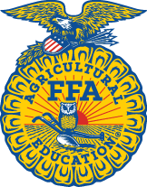
The Emblem
Our most formal mark
The full crest, with the rising sun, eagle, owl, plow, and ear of corn. Reach for it on ceremonial and official moments: awards, national communications, and signage.
- Comes in three-color, one-color, and embroidered versions
- Give it room: keep clear space around it, about half its width
The Lettermark
Your everyday workhorse
The FFA letters. Use it on most of what you make: presentations, flyers, social posts, and event graphics. It is built to be flexible.
- Seven approved colors to choose from
- Outlined for clean backgrounds; solid container for busy or photo backgrounds
The FFA name is a mark too. “FFA” and “National FFA Organization” are protected trademarks. Write them as shown here, and pair them with the emblem only in approved ways.
Use one at a time. The emblem and the lettermark do different jobs, so they don’t appear together on the same piece. Pick the one that fits the moment.
Our Colors
Build With Our Colors
Blue and gold do the heavy lifting, backed by warm, cool, and neutral palettes. Every color lists its print and digital values, including Pantone (coated and uncoated), CMYK, RGB, and HEX. Click any value to copy it.
Primary
Warm Palette
Cool Palette
Neutral
A note for screen work: to keep white text readable on solid Corduroy and Steel backgrounds, this website uses slightly darker web shades (Corduroy #16274A, Steel #177E93). The values above are the official brand colors for print and design.
Type
Our Type
FFA uses four typefaces, and each has a job. Reach for the right one and your materials will feel unmistakably FFA. Here they are, shown in their own faces.
Grow the Future
Anton — titles and large headers. Our loudest voice; save it for the big moments.
Real skills, real leaders, real communities.
Montserrat — everyday headers and body copy. The workhorse you will use most.
“We aren’t just growing crops. We’re growing people.”
DM Serif Text — quotes and select headings. A touch of editorial warmth, used with intent.
Blue & Gold
Brandon Smith Stamp — decorative only. A rare flourish, never for headings or body text.
Get the Fonts
Three of our four typefaces are free. Here is where to grab each one.
- Anton — free on Google Fonts. Titles and large headers.
- Montserrat — free on Google Fonts. Everyday headers and body copy.
- DM Serif Text — free on Google Fonts. Quotes and select headings.
- Brandon Smith Stamp — a paid font by Pen Culture, from $18 (desktop license) on Creative Market. Decorative accents only.
/A quick rule of thumb: Anton for the big moments, Montserrat for the words people actually read, DM Serif for a touch of warmth, and Brandon Smith Stamp only as a decorative accent. Full type specifications also live in Brand Resources and on the Brand Portal. Not sure which weight to use? Email licensing@ffa.org.
Chapter & State Logos
Get a Logo, Don’t Build One
Chapters, state associations, clubs, and events often need their own logo. The good news: you don’t have to design one. FFA has a lockup system that pairs the lettermark with your name in an approved format, so every entity’s logo stays clear, structured, and unmistakably FFA at any size.
One important step: the National FFA Marketing & Communications team approves all lockups and must review any custom logo before materials are ordered. Reach out early and they’ll set you up with the right files.
Social & Digital
Show Up Online
Your profile picture is often the first FFA people see. A consistent avatar makes every FFA account feel like part of the same family. A few simple habits keep it looking right:
- Use the same avatar across every platform.
- Pick a background that contrasts with the mark and reinforces our core palette.
- State chapters: use the provided state avatar format, so the country reads as one.
- Skip the full name in the image, the profile name already shows it.
Avatar and social assets, including state formats, are in Brand Resources and on the Brand Portal.
Photography
Show Real People
Photography is often how someone meets FFA before they read a word. The strongest FFA images are real moments rather than staged ones: members at work, chapters in their communities, and agriculture as it actually looks. A few habits keep it feeling true:
- Choose real members in real settings over stock photography.
- Show the work itself, including the hands, tools, animals, and land behind it.
- Keep the mood hopeful and forward-looking.
- Show the breadth of agriculture, including the science, business, and technology in it.
- Reflect the whole FFA community, so every member can see themselves in the picture.
When an image will represent FFA publicly and you are not sure it fits, ask before you publish.
Voice
Sound Like FFA
How we sound matters as much as how we look. Our voice is confident, grounded, and forward-looking, and it always feels warm and inclusive.
Aim For
- Be bold, not brazen. Confident, never aggressive, and always warm.
- Show, don’t tell. Use concrete examples and real stories.
- Stay positive. Lead with the tangible good that comes from FFA.
Avoid
- Tired taglines. Don’t lean on the same few phrases.
- Clichés and jargon. Reach for language that feels fresh.
- Mediocrity. Say who we are with conviction.
Above all, keep it clear and simple. Lead with the plain, human point, and let the details follow.
Toolkit
Get the Assets
Everything you need lives in two places, all approved and ready to use: emblem and lettermark files, color values, fonts, chapter and state lockups, the Proud to Support logo, social and avatar assets, and templates.
When in Doubt, Ask
These guidelines exist to make your work easier, not to slow you down. If you’re not sure which mark to use, need a chapter or state lockup, or want a file you can’t find, reach out. We’d rather help early than fix later. Promotional uses are approved by the Marketing & Communications team before anything is ordered.
