Identity
Our logos represents FFA at the highest level. It’s critical to who we are as a brand. Follow these guidelines to ensure the consistent use of these assets across media in order to build a strong, cohesive brand.
Anatomy
FFA uses the emblem and lettermark to represent our organization. These identity assets should only be reproduced from authorized digital files. Do not attempt to manipulate, alter, or modify them for any reason.
EMBLEM
The emblem is reserved for official national communications, such as stationery and signage. It may also be used for high-end applications, such as merchandise and gifts, but only with approval from Marketing and Communications.

Lettermark
Our primary identifier is the FFA lettermark. It must be present on all communications.

Lettermark Modifiers
Modifiers are applied to the lettermark when entities, groups, or divisions need their own differentiating identities.

Emblem
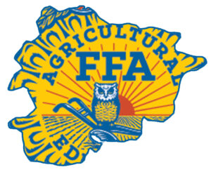
Our emblem is an important part of FFA’s heritage that holds crucial brand equity, and we treat it as a formal representation of the organization. The components include the rising sun, the eagle, the owl, and the plow, all encircled by the cross-sectioned ear of corn. You can learn more about the symbolism of these elements in the Official FFA Manual.
The emblem is reserved only for official national communications. For example, it can appear on ceremonial documents and official awards. There may be additional instances where the emblem is required; however, each use of the emblem should be evaluated on a case-by-case basis. Some applications may require special permission from the Marketing and Communications division at National FFA. In most cases, the lettermark should be used in the emblem’s place.
The emblem should never be locked up with the FFA lettermark and should not be altered in any way. The versions of the emblem on this page are the only versions permitted.
THREE-COLOr VERSION

One-Color Version

Note: This one-color white emblem should be used for engraving and etching purposes only. If you absolutely need to use a white emblem, please use the one-color version found on the FFA Brand Center.
Embroidered Emblem
Part of the uniform worn by FFA members at local, state, and national functions is the blue corduroy jacket. It is one of the most recognizable symbols of the organization.

Clear Space
Ensure that clear space is maintained around the emblem for legibility and prominence. Photos, text, and graphic elements must follow these guidelines. Use one half of the FFA mark’s width as a measuring tool, as shown.

Emblem Misuse
To ensure consistent use of the emblem, avoid the examples below.
DON’T skew, bend, stretch, or rotate the emblem in any way.

DON’T crop the emblem.

DON’T place emblem into a container.

DON’T add extra elements to the emblem.

DON’T use drop shadows or other visual effects with the emblem.

DON’T use any colors other than those specified in this document.

DON’T combine the emblem with other graphic elements.

DON’T use the emblem as a supergraphic.

Lettermark
Inspired by the slab serif font used in our emblem, our lettermark is a modern interpretation of FFA’s heritage. Its structure has been streamlined for flexibility across all media.
Lettermark
Our custom lettermark was developed to exacting standards. Because of its precise construction, it is important to maintain consistent scale and spacing every time.

Lettermark Spacing
To achieve maximum impact and legibility, clear space must be maintained around the lettermark, as shown here. It may be placed on top of simple photography, but no other graphic elements, typography, rules, or images should appear inside this clear space.

Minimum sizes
To maintain good legibility, never reproduce the lettermark smaller than shown here, for print or screen. There is no maximum size limit, but use discretion when sizing the logo. It should never be the most dominant elements on the page, but instead should live comfortably and clearly as an identifying mark.
![]()
Lettermark Colors
While there are many colors in our palette, the seven colors here are the only authorized colors to use for the lettermark. The color of the background will determine which version of the lettermark to use. Plan your layouts to accommodate using one of these options.

LETTERMARK Container
The lettermark container was developed for specific instances in which the lettermark must appear on top of a textured background, such as a detail photo. The container provides structure around the lettermark, anchoring it into a composition. Use the outlined container for simpler backgrounds. Use the solid container for busier backgrounds that lessen the lettermark’s legibility.

LETTERMARK SPACING
Although the containers were created to accommodate busier layouts, it is still important to achieve maximum legibility around the lettermark. Give the containers the allotted clear space to achieve the best impact.

MINIMUM SIZES
Like the lettermark, never reproduce the containers smaller than shown here, for print or screen.

Container COLORS
Like the lettermark, the seven colors here are the only authorized colors for the container logos. The color and texture of the background will determine which container version to use.

Filled Solid Container COLORS
The filled solid containers can be used only in the five color combinations shown here.

Lettermark Misuse
Here are a few practices to avoid when using the FFA identity. Adhering to these rules will ensure that our lettermark is recognizable and builds as much equity as the emblem.
DON’T skew, bend, stretch, or rotate the lettermark in any way.

DON’T crop the lettermark.

DON’T place lettermark into a container. The convention logo is the only exception to this rule.

DON’T create an outline of the lettermark.

DON’T use drop shadows or other visual effects with the lettermark.

DON’T use any colors other than those specified in this document.

DON’T combine the lettermark with other graphic elements. The convention logo is the only exception to this rule.

DON’T pair the lettermark with the emblem.

Architecture Construction
FFA has many chapters and associations that require individual logos. To accommodate this need, we’ve created a simple architecture system that will allow all entities to have logo lockups that are clear, structured, and flexible for all applications. Logo consistency across all national communications materials will also strengthen the equity of the new lettermark.

Using the State modifier
The National FFA Marketing and Communications Division has created new logo lockups for each state. These logos should be used on outward-facing communications, particularly for pieces whose readers may be unfamiliar with FFA.

Using the State icon modifier
Using the state icon modifier may allow you to make the logo bigger, which can be helpful when designing pieces that offer less room. Reserve the state icons for less formal communications.

Using the icons
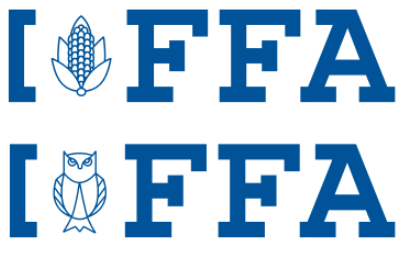
We’ve developed a library of icons that represent various ideas and symbols that are specific to FFA. These icons can be used to create custom logos for specific groups or members of FFA. Marketing and Communications has already created a variety of these logos for specific groups.

Arhitecture Construction
Creating new brand architecture lockups is an important task for any entity within the FFA brand. Adhering to the specifications of the lockups will help us maintain the integrity of the organization while allowing entities to clearly communicate their individual identities.
Note: Always use the provided templates when creating new lockups. Never create a lockup from scratch.
One line

Line Length Limit
When typesetting names on one line, do not exceed the space occupied by the length of one and a half lettermarks. If this space is not enough, use the two-line framework below.

Two line

The distance between the bracket and the type is equal to the width of the bracket’s vertical line.
Icons
Because the proportions of each icon vary, the height of the icon must be carefully evaluated each time it’s used to maintain proper hierarchy with the lettermark. However, for consistency’s sake, it should always fit within these highlighted areas. Always center the icon within this a vertically and horizontally.

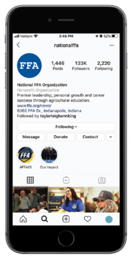
An avatar is another name for a profile picture. Avatars appear in various small sizes and often share a standard circle or square proportion. Since social media avatars consistently appear with the official name of the page or profile, it is not necessary to include full names as part of the avatar’s design. The avatar should be the same graphic asset used across all social media platforms.
Background Colors
Choose background colors that provide enough contrast with the mark and reinforce our core palette.

Proper Scale
Arrange marks so that they sit comfortably within both the circle and square shapes.

State Modifiers
We’ve provided a design format for state chapter avatars. This structure allows each state to have its own profile picture, while maintaining a cohesive look across the country.


Trademark Policy
With brands of immediate recognition, loyal and enthusiastic members and alumni, FFA licensed products offer competitive advantages in the consumer marketplace. Each year, new youth and adults enter one of our many programs, exposing thousands to the strength of the FFA mission and vision.
TRADEMARK LICENSING
Licensing is when a company pays a fee to use our brand on products. Licensing with the National FFA Organization is only available with the National FFA Organization. There are various levels of licensing with the National FFA Organization depending on the desired customer base you are seeking.
Licensing programs can be tailored to your specific needs. Opportunities include selling wholesale on commercial markets, selling at retail (including e-commerce), selling directly to local chapters or state associations and selling directly to a single chapter or state association.
Commercial Co-Ventures
A commercial co-venture with the National FFA Organization is a unique business project or marketing campaign between a for-profit business and the National FFA Organization. These projects generate shared awareness and revenue for our cause while increasing revenues for the supporter.
Commercial co-venture ideas include point of sale transactions (active or passive), messaging campaigns, purchase or action-triggered campaigns, employee engagement efforts and other digital programs.
In connection with all commercial co-venture marketing promotions benefiting the National FFA Organization, it is required that the corporate partners help raise awareness and educate the general public on the importance of Agricultural Education and FFA. We ask that all of our commercial co-venture marketing partners to publish the National FFA Organization’s website, and our proud to support logo on all partner promotions, events marketing packaging and related advertising materials.
Protecting the FFA Brand
FFA has the sole and exclusive right to use its proprietary marks, but a failure to regulate the use of these marks by third parties may result in their passing into the public domain and out of FFA control. The protection and enforcement of FFA trademarks and the FFA brand requires centralization to know which uses of the marks and brand are infringements, and which have been properly authorized and are consistent with the values, purposes and Charter and Bylaws of the National FFA Organization.
As a trademark owner, National FFA Organization is obligated to protect against unauthorized or potentially confusing uses of its trademarks and therefore carefully manages their commercial use. No one can use the FFA marks for a commercial purpose without the express written permission of National FFA Organization.
A local chapter may not use the FFA marks for commercial purposes; nor may a chapter, state association, state foundation, National FFA Foundation, member, or alumni chapter grant such rights, either actual or implied, to any third party. All above mentioned are responsible to adhering to these same requirements and standards for product purchases and must use either purchase direct from the National FFA Organization Merchandise Center or an Official Licensee. The Merchandise Center, which is specifically charged with serving as the designated product supplier for the National FFA Organization, FFA State Associations and FFA Local Chapters, holds its vendors to a review process very similar to that of licensees.