Visual Elements
Our visual elements are distinctly ours: they’re a key way to differentiate ourselves. Each element speaks differently, but it all emanates from a single visual voice.
Color
Primary Colors
Our primary palette consists of blue, yellow, red, and green. Our layouts lean heavily on these colors, mixing in the secondary palette to build color schemes that are complementary and balanced.
Coated Paper
When printing on most coated stocks, on specially treated uncoated paper, or on UV presses, use the Pantone spot color or the CMYK formulas specified under the term “coated.”
Uncoated Paper
When printing on most uncoated stocks, we adjust the spot color and CMYK formula of the color palette to achieve the best results. Use the specified formulas labeled “uncoated.”

SECONDARY colors
Warm Palette
The subdued nature of the warm palette is inspired by FFA’s storied legacy, and was developed to complement the use of archival images and icons.

SECONDARY colors
Cool Palette
The cool palette is inspired by agricultural lands across America. From oceans and seas to fields and grass, these colors provide depth and richness to our bold and vibrant primary palette.

Neutral colors
Always consider the use of white space. Proper white space allows the composition to breathe and makes the content prominent. Too much content or too many colors can make for a busy composition.
The neutral tones act as a balance for the vibrant primary tones, just as white does. Use them as needed to fill excess white space or to evoke a different mood.

sample color Palette
To strike the right balance of color for a desired effect, use these color spectrums as a guide. This chart is not a precise mathematical system, but instead provides an idea of relative use. Color groupings can range from formal to casual and from subtle to bold, depending on the piece’s purpose and audience.
The diagrams below illustrate how we might distribute colors proportionally to generate specific moods for marketing pieces. Of course, this doesn’t mean that every color shown must be used to fulfill the requirements of the brand. At a minimum, we always lead with primary colors.

Typography
Montserrat
A friendly typeface that can feel both casual and sophisticated. This typeface works well for headlines, body copy, and captions, depending on the weight.
Foundry Google
Designer Julieta Ulanovsky
To install this font for free, go to
https://fonts.google.com/
Alternate System Fonts
Our brand fonts may not always be available to everyone. Arial is the acceptable substitute for Montserrat.
Arial Regular
Arial Italic
Arial Bold
Arial Bold Italic
Characters

Weight

Anton
This clean typeface feels bold and modern. It should be used only for short blocks of text, which should always be set in the font’s regular weight. All-caps should be reserved exclusively for shorter headlines.
Designer Vernon Adams
To install this font for free, go to
https://fonts.google.com/
Alternate System Fonts
Our brand fonts may not always be available to everyone. Impact is the acceptable substitute for Anton.
Characters

Weight

DM Serif
A serif typeface that can work for all audiences. This typeface is diverse, and can feel both formal and casual, depending on how the type is treated.
Foundry Google
Designer Colophon Foundry
Frank Grießhammer
To install this font for free, go to
https://fonts.google.com/
Alternate System Fonts
Our brand fonts may not always be available to everyone. Georgia is the acceptable substitute for DM Serif.
Characters

Weight

Brandon Smith Stamp
This decorative typeface feels illustrative and vintage. It should be reserved exclusively for shorter headlines.
Foundry Google
Designer Colophon Foundry
Frank Grießhammer
To purchase this font, go to
https://creativemarket.com/PenCulture/ 3845476-Brandon-Smith-Monoline-Font
Characters

Weight

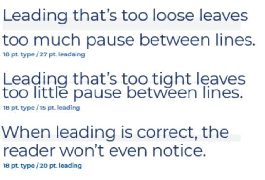
Leading
Line spacing, called leading, is critical to setting professional-looking type that’s easy to read. Leading should be set tight, but not too tight. All our typefaces generally look best with leading set slightly looser than the default. A good rule of thumb is to start with leading that’s two points higher than the point size of the text. This won’t always be right, but leading can be adjusted easily from there.
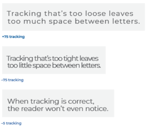
Tracking
Correct letterspacing, called tracking, also helps to make the type easy to read. Outside of headlines, it’s usually acceptable to use the default tracking; however, you may need to increase tracking at small scales, and decrease it at large scales. Optical kerning should be used when available. The term “tracking” refers to overall letterspacing for groups of letters and entire blocks of text. The term “kerning” refers to selective letterspacing between pairs of characters.
Hint
Trust your eye. If the space between lines or characters looks too tight or too loose, it probably is. Remember, the main purpose of leading and tracking is to make it quick and easy for readers to digest multiple lines of copy.
sample typesetting
Sample 1: shows just one example of how we can combine our different typefaces to establish hierarchy and create visual interest in a layout. There are many ways this can be done, so use this sample as a baseline and modifying it as needed.
Headline
Anton Regular | All-Caps Size: 40 pt | Leading: 40 pt Kerning: Optical | Tracking: 20

Subhead
Montserrat Black | All-Caps Size: 9 pt | Leading: 12 pt Kerning: Optical | Tracking: 0
Body
Montserrat Light Size: 8 pt | Leading: 10 pt Kerning: Optical | Tracking: 0
Lead-in / Pull quote
Montserrat Black Size: 14 pt | Leading: 19 pt Kerning: Optical | Tracking: 0
Body
Montserrat Light Size: 8 pt | Leading: 10 pt Kerning: Optical | Tracking: 0

Overline
Montserrat Black | All-Caps Size: 8.5 pt | Leading: 12 pt Kerning: Optical | Tracking: 0

Heading
DM Serif Text Regular Size: 47 pt | Leading: 44 pt Kerning: Optical | Tracking: 0

Subhead
Montserrat Black | All-Caps Size: 9 pt | Leading: 12 pt Kerning: Optical | Tracking: 0
Body
Montserrat Light Size: 7 pt | Leading: 9 pt Kerning: Optical | Tracking: 0
sample typesetting
As part of our visual brand, one technique we use is breaking up compelling copy with multiple typefaces and styles. Juggle between two chosen fonts to highlight the bigger, more important words in the text you’re typesetting. This approach is best reserved for shorter headlines and sentences, as it is very easy to overdo this technique.
Two Typefaces
This example uses DM Serif Text Regular for the higher-impact words, and Montserrat Regular for the rest of the sentence.
Draw a shallow, symmetrical curve and apply the supporting text, using the type on path tool to create the sunrise overline. Center-align the most important phrase to create a strong horizontal line.

Two Typefaces
This example uses Anton and Brandon Smith Stamp Regular.
Use the strong horizontal lines of the all-caps Anton letterforms as a baseline for the rest of the text, set in Brandon Smith Stamp Regular.
Three Typefaces
Reserve using three fonts for situations where hierarchy is key.
Create contrast by applying the serif typeface (DM Serif Text Regular) to the most important phrase, making the text significantly larger. Then set the other supporting text in sans-serif typefaces.

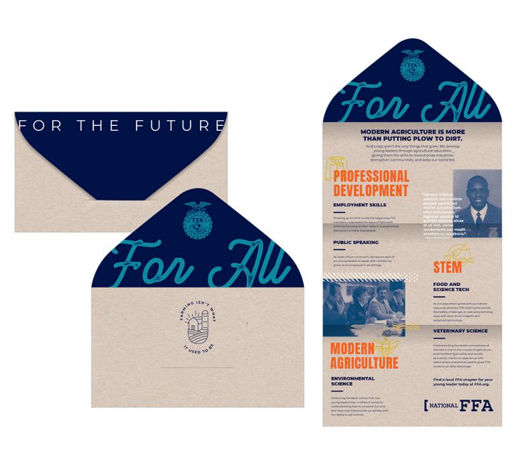
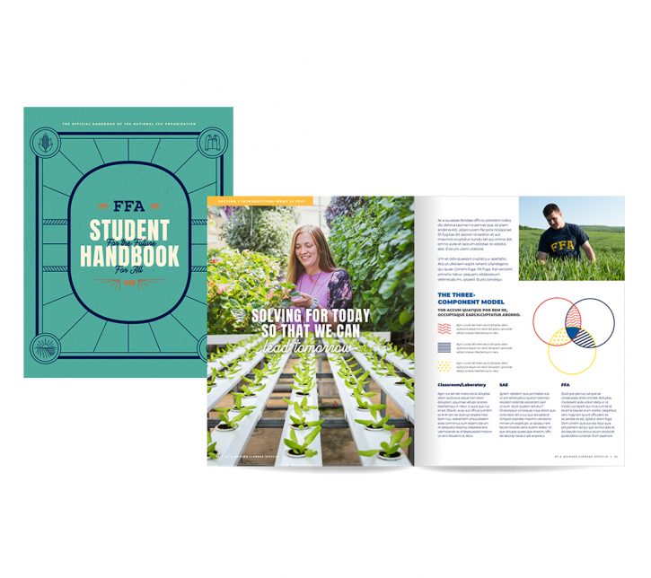
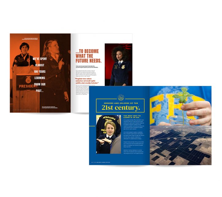
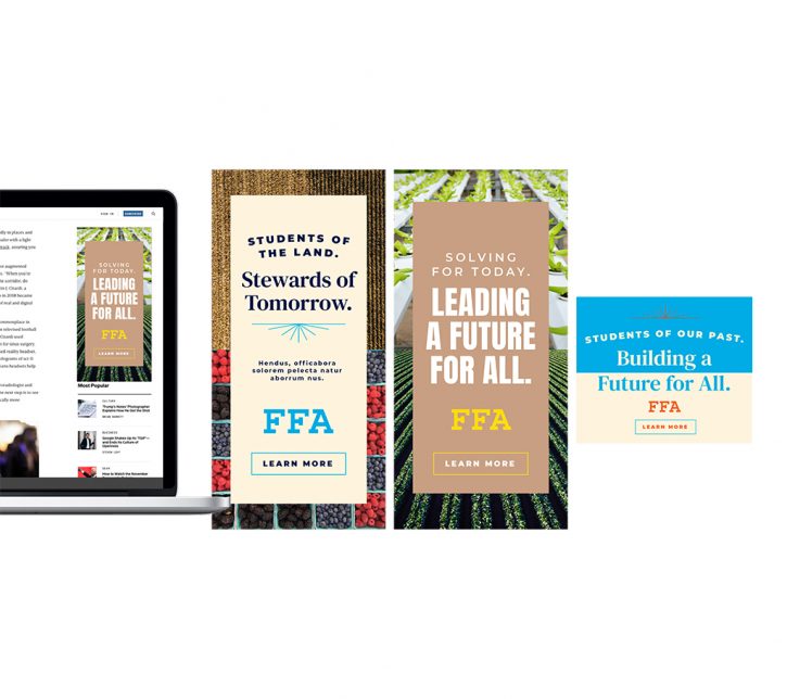
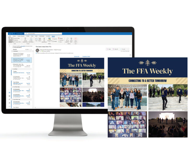
Photography
We use a wide range of photographs to showcase our unique people, culture, and experiences through three main subject groups. Photography plays a huge role in overall composition, so it’s important to choose the best possible photo for every piece being designed. Be sure to select photos that feel the most organic and natural, while still relating well to the associated content.
Lighting Considerations
Natural light is always ideal. Photo retouching may be needed to adjust the image’s focus or add a warming filter.
Image Sources
Our images come from two royalty-free resources, which can be used to find photos for any communication piece. unsplash.com | pexels.com
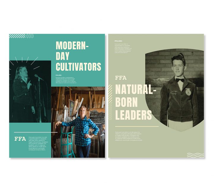
People
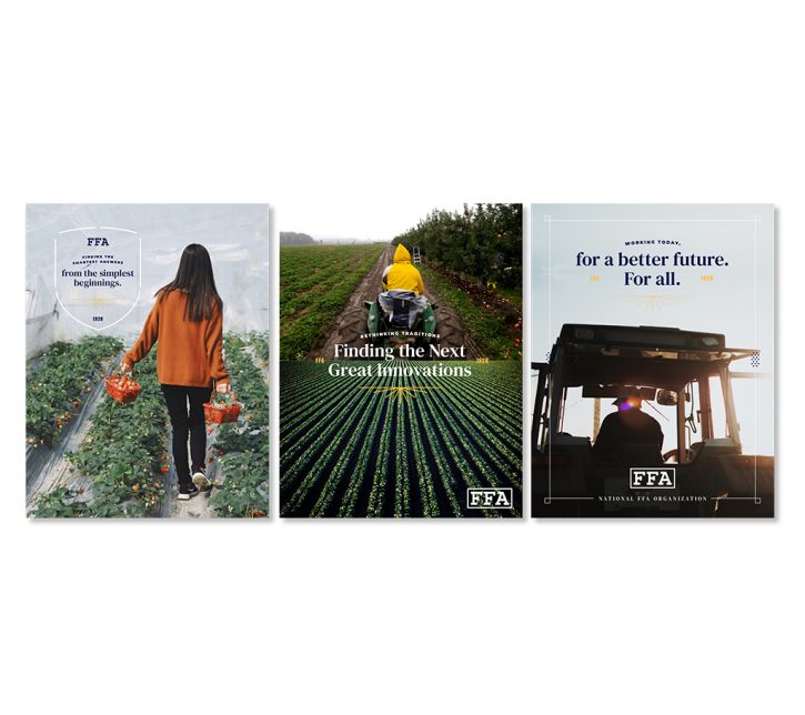
FFA members are our organization’s most important asset. We feature our members, educators, and alumni in candid, active portraits. These images should feel authentic and in-the-moment, and should use natural lighting. When possible, include shots of students engaging in their work, performing research or services, or interacting in groups during moments of fun and friendship.

Choose photographs that feature strong horizon lines, when possible.
Details
Photographs of objects and details help round out our story and add further visual depth. They can help illustrate a topic (such as research), provide additional visual interest, or act as background filler or texture.

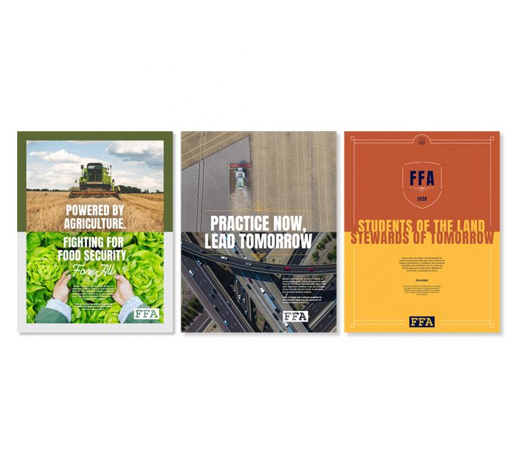
Expansive Drone Shots
Celebrate the beauty of agriculture and the ornate complexities of our country’s land by featuring vast landscape shots. These images provide context by detailing the expansive impact we have on the world.

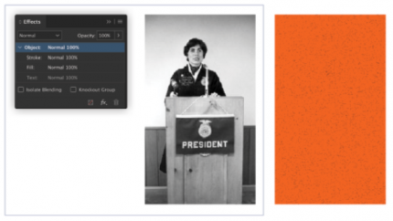
ARCHIVE PHOTO Duotone TREATMENT
FFA honors its rich history by using archival imagery. By applying a duotone treatment, we give these historical images a modern touch, representing FFA’s commitment to providing for generations. We use this technique to elevate the images so that they feel vibrant and activated. Follow these step-by-step instructions to achieve the duotone effect.
Step 1
Select a relevant archive photo from the FFA image library. Choose a color that complements the design of the piece that will feature this photo, and create a color-filled box. Adding the grit texture to your box can enhance the effect, but isn’t a necessary element to add every time.
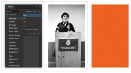
Step 2
Select the image and click the effects menu in InDesign. Under blending mode, select “Multiply.”
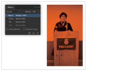
Step 3
Place the historic image on top of your selected color field.
Graphic Elements
Our graphic elements offer a key way to differentiate the FFA brand. When we use them appropriately, they create energy and depth as part of a visual system that’s unique to our organization.
Think of the suite of graphic elements as a toolbox for creating layouts and compositions in our brand. No project will use all the items in the toolbox, but most projects should use some of them. Trust your eye: if it feels too busy, it probably is.
grit texture
Conceptually, the grit texture represents the idea of hard work and determination. The random pattern and active energy represent creative expression and the messy nature of discovery.
Changing the scale of patterns and textures can produce a wide variety of effects. Large textures can take over the visual focus of a layout. Smaller scales can cause visual noise. Use caution when combining this element with color and type.
Color variance is another way to produce many different effects. Colors shouldn’t contrast too much, and type should still be extremely legible.
To create better legibility, use colors with similar values or monochromatic pairs. To create bolder compositions, choose colors with high saturation and greater contrast.

Icons
Our icon set includes both specific objects and relevant symbols. Each icon can be used to express a variety of ideas, including those specific to FFA and its history.
The icons always appear in a single color. They are shown here using the color “Bronze,” but they can be set in any color from the palette that complements the design.
Icons
Icons are used as accent graphics in layouts or as anchoring devices for copy. When locking up text with custom icons, there are a few guidelines to follow.
These icons should not be added merely for decoration, but rather to facilitate communication. Our brand uses them in moderation, to beautify and enhance our designs.
Copy Dominant
Use icons to break up long paragraphs of copy and to aid in storytelling.

Type-Dominant
Use icons as accent graphics when framing specific phrases or sentences.

Badges
Wrap type around an icon to create an accent graphic that enhances the story we’re telling.
Type and Icon Used Eqully
Use icons as images when designing a layout that features very little information. This technique should be used sparingly, as it can quickly overwhelm a composition.

Patterned Linework
These linework patterns are derived from bird’s-eye views of farmland and fields. They can take any angle appropriate for the layout.
Lines can cut off a small edge of an image and move the eye to another part of the page. They do not have to be connected to information; they can also simply decorate an image or add complexity to a layout.
Changing the size of patterns can produce a wide variety of effects. Increased scale can create a bold and dramatic design, while smaller scales can make a design feel clean and elegant. That said, overusing these patterns can make compositions feel too dense, so use caution with color and type.
Color variance is another way to produce many different effects using the same patterns. Colors shouldn’t contrast too much, and type should still stand out. Note that small or thin type may not stand out when it’s set near a bolder pattern. Choose legibility over style every time.

To create better legibility, use colors with similar values or monochromatic pairs. To create bolder compositions, choose colors with high saturation and greater contrast.
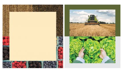
FRAME TEMPLATES
We have a set of rectangular frame templates that can be used as borders for entire compositions, or as containers for elements within a layout. These frames can be resized proportionally, as long as the line shapes are not warped. If necessary, the spacing between the center frames can be slightly different on the vertical and horizontal sides.
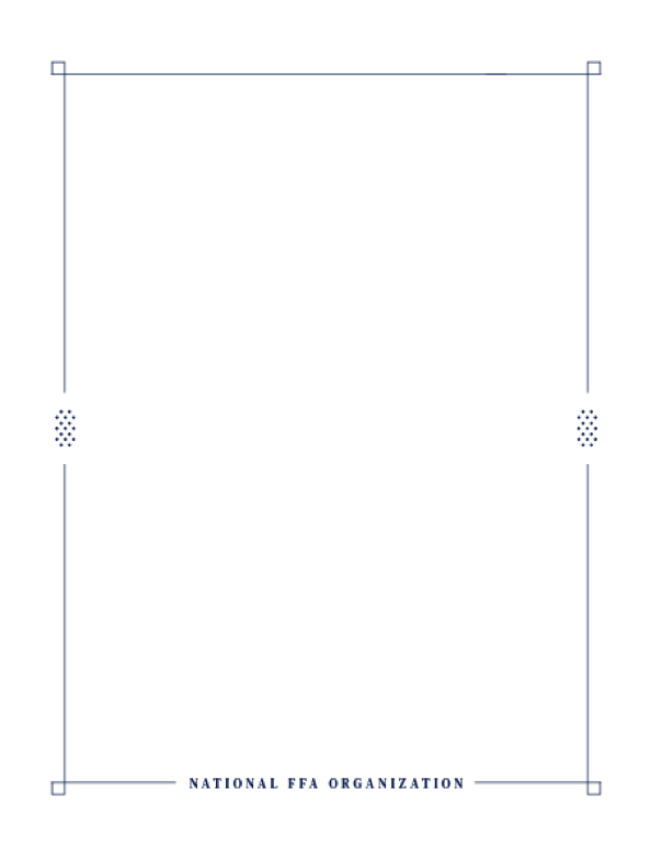
Simple Frames
The simple frames are versatile: they can be used to surround an entire composition or individual elements within a layout.
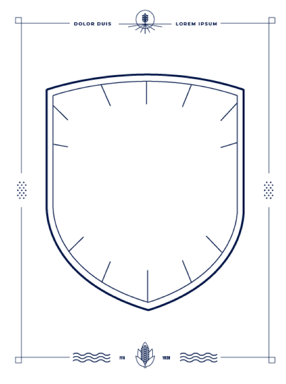
Shield Frame
The shield frame works best when it’s used as a detail, calling attention to an important bit of information in the center of a layout.
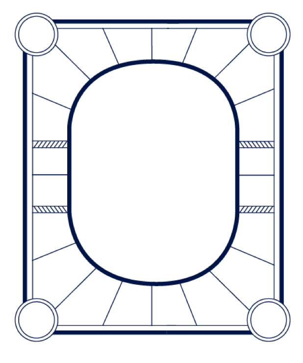
Sunburts Frame
The sunburst frame is used as the main design of a composition, to surround a very limited amount of copy.
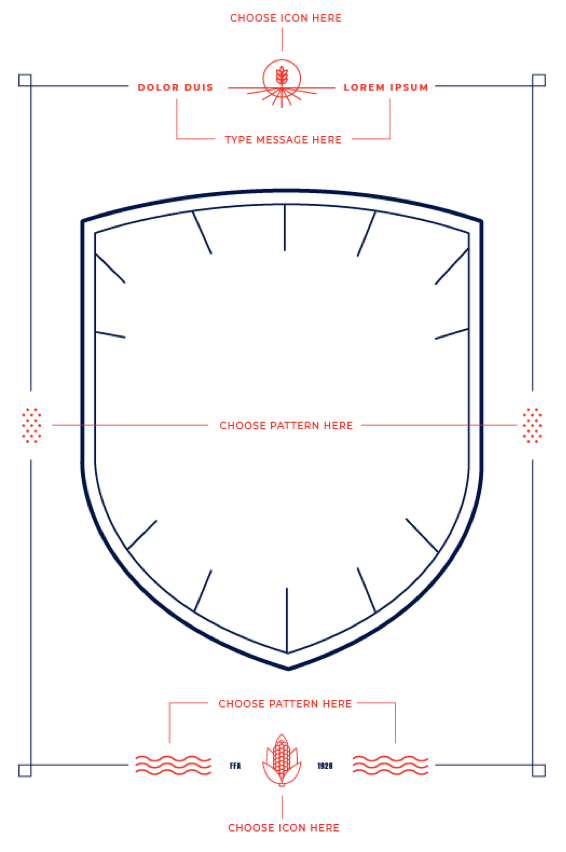
Customize a Frame
The majority of the frame templates offered are locked proportionately to avoid improper scaling. However, some elements of the customizable frames can be altered to better fit your composition or content. Choose the frame that best complements your page design, and change it only as much as necessary.
ADDITIONAL FRAMING ELEMENTS
Using linework that resembles our rectangular frames, we’ve created a series of additional framing elements intended to be combined with smaller bits of copy and photography. These elements should never frame an entire composition; rather, they should highlight specific areas of interest and draw attention to important details.
Examples

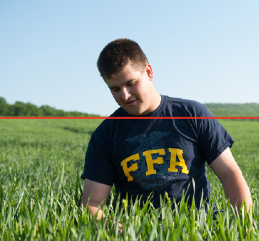
USING THE HORIZON LINE
Members of FFA have their boots on the ground, constantly working on practical, real-world problems. At the same time, these members represent the future of agriculture, and bring forth the blue-sky ideas that will help solve tomorrow’s problems. This theme is realized through a grid system that centers on a “horizon line.” The grid features a consistent, vertically centered line that separates the design into top and bottom halves.
There are many ways to use the horizon line when designing in this grid. Whether it’s an actual rule line, or an implied line created when two elements butt up against each other, the horizon line grid can be achieved in a variety of methods.
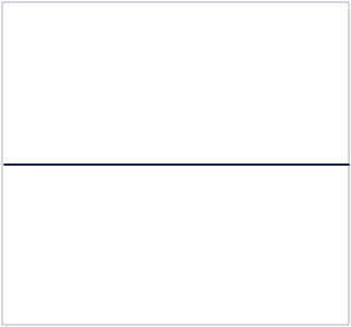
While drawing a literal line in the middle of your composition is a simple solve, follow these suggestions for more dynamic results.
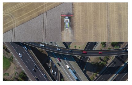
Photo Line
When pairing photographs to create the horizon line, juxtapose two images that reflect some sort of contrast. This example compares the complexity of farmland to the complex linework of a highway system. Both images are drone shots that feel like they were taken by the same camera; however, their dramatic difference in content makes for a striking composition.
Type and Color Line
Horizon lines can be designed using only color and typography, like the example at the right. This style works well when using the headline constructions, but it should only be employed when a composition features no photography and very few other graphic elements.

Border Line
Creating a horizon line as part of a border — either using contrasting colors or photography — can add interest to a simple composition. This style lends itself well to digital applications, when room for content is limited.
Sample Tactics